Dynamic Ad Design System Optimization
GreedyGame SDK X
Context
GreedyGame's former SDK : SDK 8 is a library for Android game developers to integrate ads in their apps for monetisation. SDK 8 can served ads from multiple ad inventories including Google AdMob, Facebook Ads, and in-house demand. The differentiating factor among the other alternatives in the ease of Native ads integration. Integrated with around 700 games, the SDK serves around 1B Ad requests per month. To rethink the product cycle and onboarding for SDK developers; SDK itself needed to be rethought.
Aim
Reduce Integration Cycle time and improve user onboarding experience
My Role
Plan features for release cycles, UX Research, Prototyping and High-fidelity mocks, UI Development
Timeline
2020 - 2021
Defining the problem
Onboarding UX and Team workflow
Confusing User Experience for Developers and Mannual design system flow in the product team
Onboarding Process
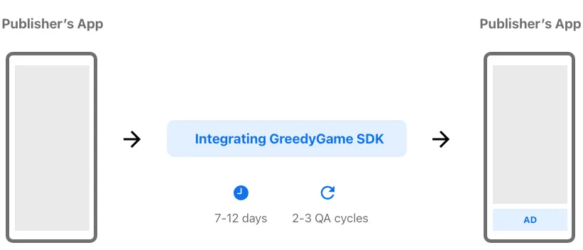
An integration cycle would start with the Sales team pitching it to the publishers, once a publisher is willing to integrate the SDK in their Android app, the design team would come up with suggestions for the ad placements and mocks, post that once everyone gets on the same page, the developer would go through the Docs on the website for the instructions to integrate using Android Studio.
Ad Unit dimension inconsistency
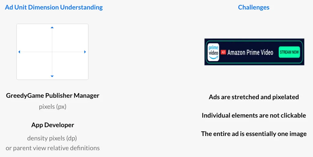
In the SDK 8 integration cycle, the designers from GreedyGame would design mocks in Photoshop which displayed ads over the screenshots to depict how the ad designs will look like when integrated. Once the app publisher approved of the placements, they would need to create ad units on the panel with an input box requesting dimensions. They did not understand what the actual values represented and how does it affect the actual ad size on Android phones.
Unable to check sample Test Ads until the SDK is implemented
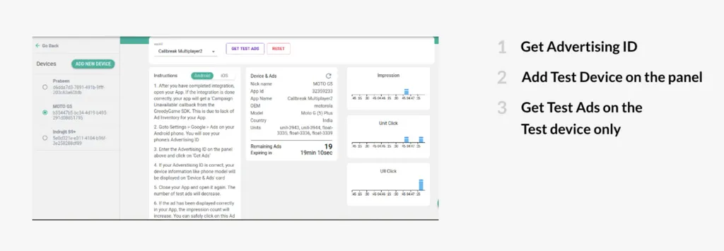
Once a developer integrated the SDK, it was a tedious task to get the sample test ads, to verify the implementation. The developers took about an hour in average to setup test ads in multiple devices. They had to verify the ad implementations such as refresh time, loading time, debugging the issues, and checking for design alignment. The process is different from Google's AdMob SDK and since a lot of developers were coming from those lines, this method seemed a little unusual and added to bad user experience.
Designing Native Ad Templates
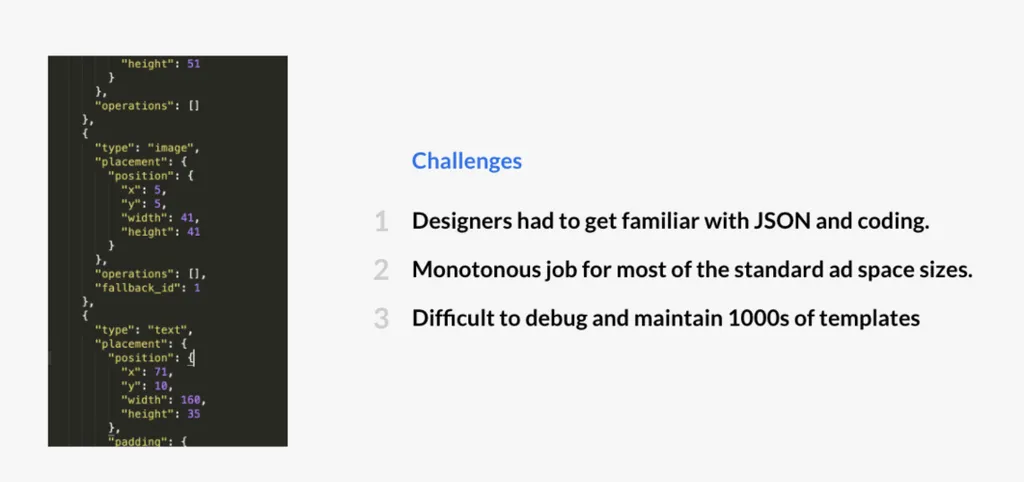
For each native ad space and each app a publisher integrated GreedyGame SDK in, graphic designers at GreedyGame had to design JSON template for the specific Ad Size, incorporating assets that matched the app's UI. This required a lot of man hours and monotonous activities that could be automated.
Designing solutions
Dynamic responsive Ad templates & User-centered Dashboard
Designed in XD and Built in Android Studio
Personas and User Flow
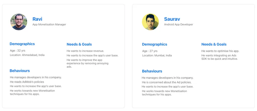
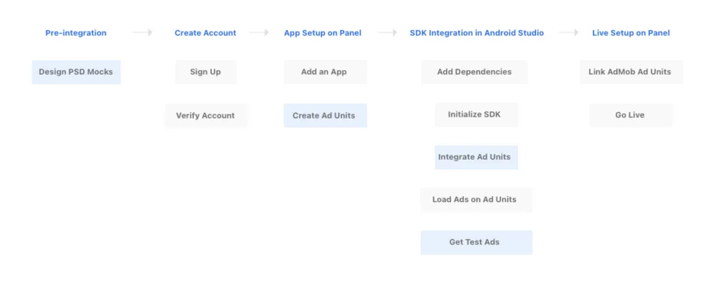
To start off, I created a provisional persona of a potential developer and a publisher based off the dataset of 100s of past clients that have integrated GreedyGame's SDK into their apps. They are either developers or publishers; this persona was created with assumptions and not fully research-based but it was something that I came back to throughout my project to guide my design decisions and priorities. I also created a user flow to show the flow for a publisher who wants to integrate SDK in his app. The highlighted areas represent the first 3 pain points which I will tacle in my design solutions.
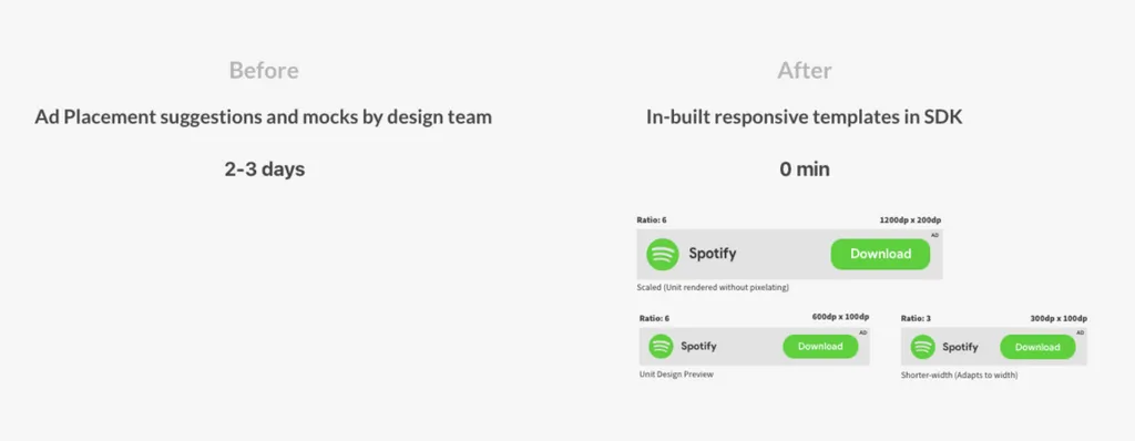
In-built responsive native templates in SDK
There are a multiple ways in which a View can be defined in Android. I have designed a decision tree which selects an appropriate ad design XML on the basis of the height and width of the ad space. The size of the text, icon, button; the location of various elements are chosen automatically. This enables the developer to visualise a Test Ad as soon as it is implemented and the size and placement can be changed accordingly in no time. This saves a lot of time in the integration process.
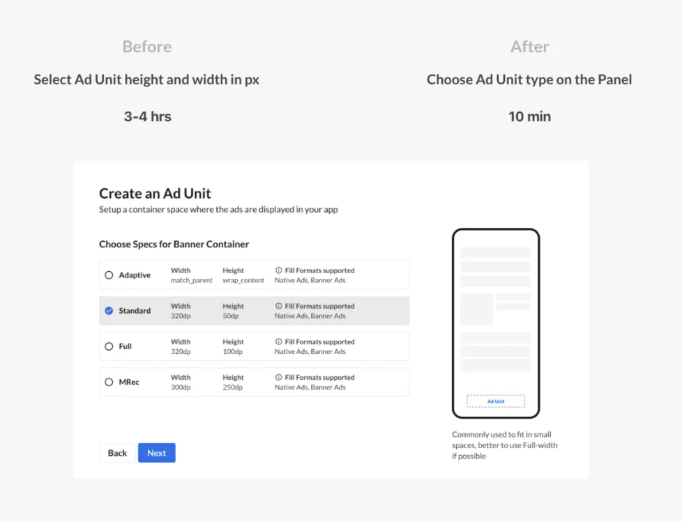
Ad Unit types and consistent dimensions
Publishers can now choose among the common ad unit types that they are familiar too, the width and height of which is a part of the Ad Unit description, that can be referred while implementing the Ad Unit in Android. I had conducted Design sessions where the different dimensions that the Android developers are familiar with were explained to the employees at GreedyGame to bring everyone to the same page.
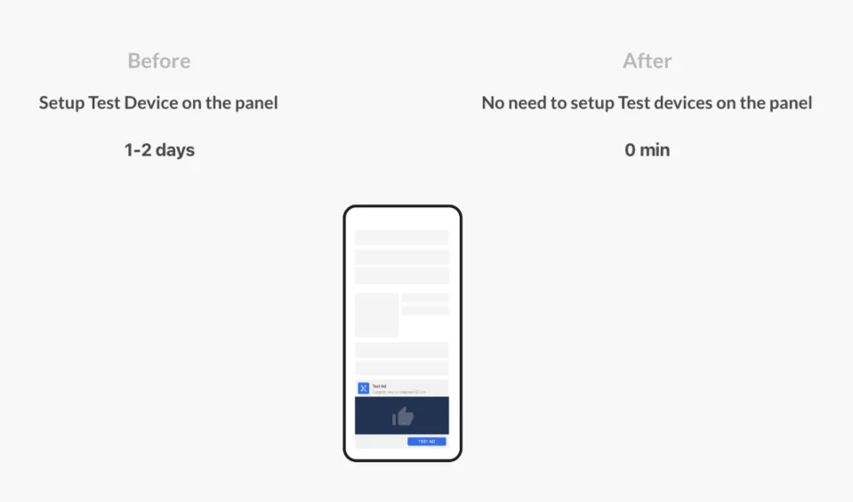
Test Ads in-built in the SDK
We have devised an easier way for developers to get test ads. By default, any debug build that is created from Android Studio will get sample test ads. If for some reason you want to see the test ads on a release build, you can enable the enableDebug(true) method in the AppConfig Builder as a part of the SDK initialization.
Results
User Analytics and Recordings
I interviewed around 10 Android app developers with each session lasting for about 2 hourse where we asked them to do the complete integration process, where I observed them throughout the process. Users were able to understand most of the things by themselves, but I had to assist them at some points through the documentation.
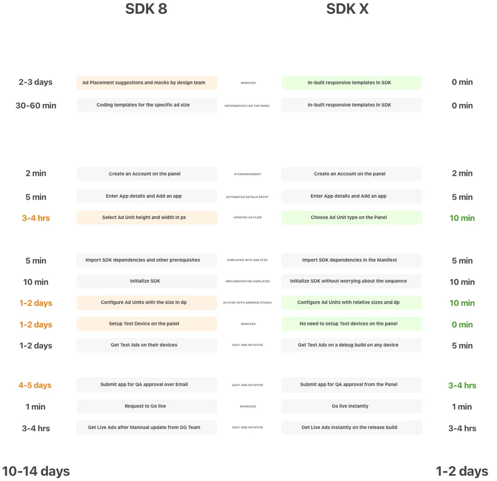
Integration Cycle Timeline
We had setup Hotjar on the SDK X Console to analyze the user behaviours and understand the discoverability. Analysing over 1800 recordings in the first month, we found that the users were able to navigate and perform the tasks on the dashboard quicker as compared to the previous dashboard. Few users were unable to unable to understand the procedure after adding the ad units as they were not used to AdMob terminologies. However, the initial target audience for SDK X were users aquatinted with AdMob hence this issue can be considered insignificant.
10x
Integrations per week
300
hours of work saved
5x
Revenue increase in Oct 2020
